Energy Rate Comparison
About the project
In a time when regulators are revamping energy rate plans to try and create new behaviors needed for a clean energy future, how might we help users understand their rate plan options and drive new behaviors?
Launch Date: Jan 2017
Product Team: Aaron Otani, Leslie Zacharkow, Ryan Irwin
Role: Lead UX Designer
What we built
A white label web application used by many utilities that allows users to compare the cost of a diverse array of electricity rate plans scalable to any utility company. The costs are calculated based on users unique usage patterns and history.
How it did
- 21% of PG&E visitors who had a cheaper rate plan available, clicked "Change your rate plan".
- 39% of PG&E visitors who would save $500 or more clicked "Change your rate plan".
- Due to PG&E visitors having to go to another site to finish the change, we were unable to track how many users followed through.
The business problem
- Users don't know about or understand their rate plan options and don't know which plan is best for them.
- Utilities are required by regulators to promote and enroll customers in rate plans that encourage overall usage reduction and reward for using less energy at peak times.
- Regulators understand that only when users comprehend their rate plan that behavior will change and are concerned by the fact that rate plans are too complex. They are looking for various ways to promote energy efficiency both in overall usage but also based on the time of day in order to better accommodate renewable sources. Energy efficiency is the cheapest energy source.
Product goals
- Help users find the best rate for them.
- Inform users that they have rate options.
- Improve user understanding of how different rates work.
- Help customers understand how their usage behavior can impact their costs.
- Convince customers to switch to the best rate for them.
Why we needed to change the existing product
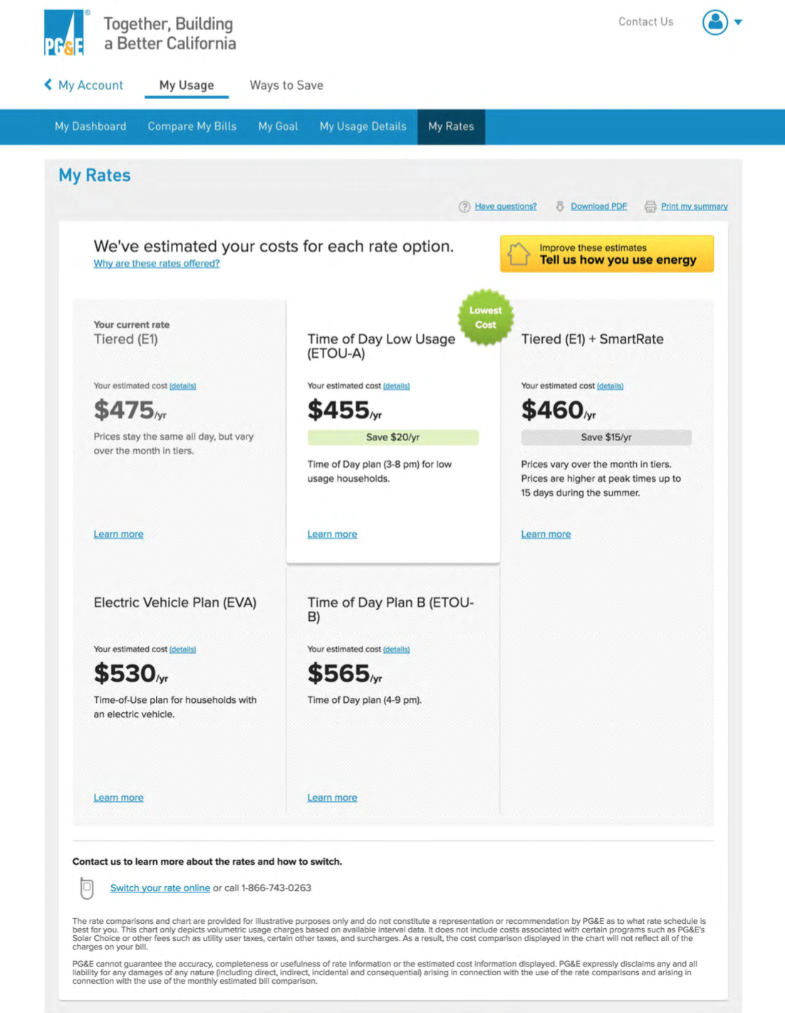
Summary page
- Rate switching actions are hidden.
- The Rate Simulator button does not effectively describe its purpose and only attracts 3% of users.
- It’s not clear how estimates are generated.
- Grid system breaks with the future introduction of 19+ rate combinations and several possible add-ons.
- It’s difficult to compare any aspect of a rate plan other than yearly cost.
- Outdated visual design.
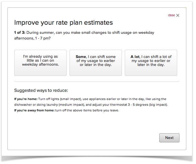
Rate Simulator
- The vague questions make users doubt the value of the tool.
- The modal is dense and hard to read.
- Modals are no longer supported by Opower.
- It’s not clear what unique impact each answer had on the cost estimates.
- User’s do not know how they could make the most impact to their Time-of-Day estimates.
Details page
- Dense and hard to read.
- Helpful monthly costs table is hidden.
- Density of information creates distrust of the utility.
- Change rate CTA hidden.
Initial Research
Analytics
- Just over 1m PG&E customers had visited the Opower pages.
- Of people who've visited the Opower pages at PGE, 30% had visited the My Rates page at least once.
- Among people who have visited My Rates at least once, they've visited it an average of 3 times per person. That again puts My Rates in the middle of the pack.
- 3% of users have filled out the Rate Simulator and only 15% of those complete it.
Comparative Research
How are other industries tackling this problem?
Concepting
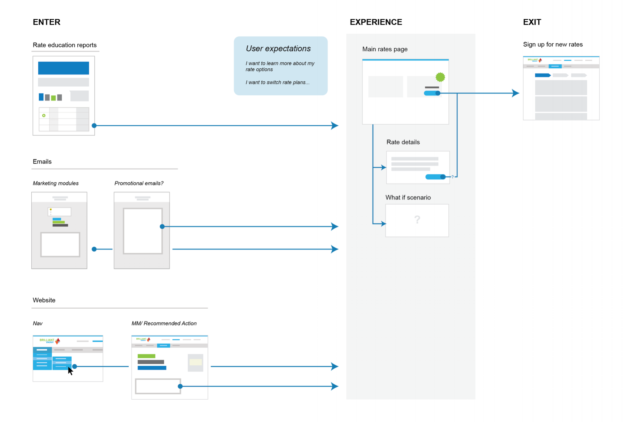
Journey mapping
First we mapped out the rough user journey.
Group ideation session
We started by generating as many concepts as we could with a larger group including PM's and other members of the design team.
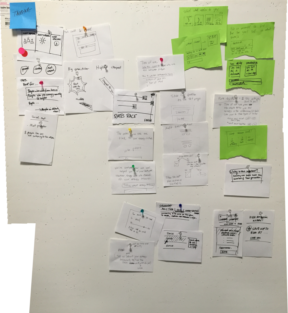
Wireframing
We then brought up the fidelity a few concepts we wanted to explore further.
Developing the content model
The success of the project, depended on how clearly we could explain rates to users, so starting off by thinking about the overall content model, helped us craft the final UI. Our final solution had to be scalable to the numerous types of possible rate plans across utilities. Here's my map of all the possible rate structures.
How might we impart the crucial information upfront?
Numerous team members collaborated on a google doc where we started to map out the content hierarchy.
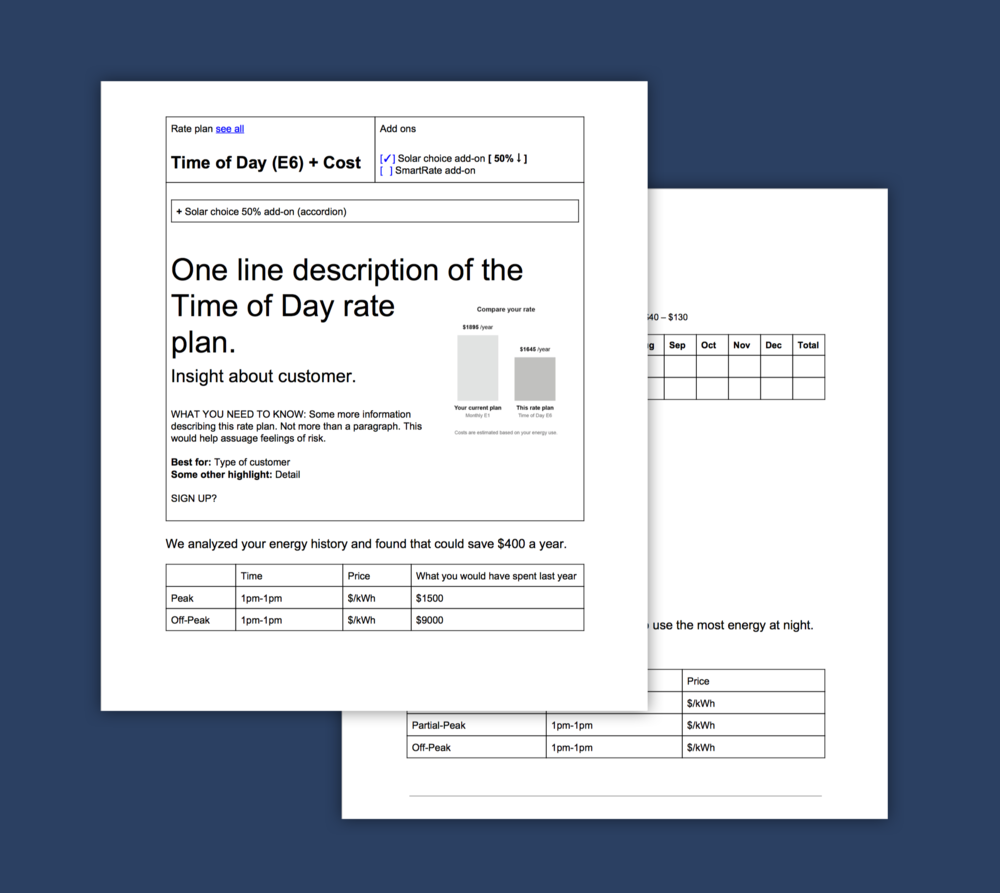
How might we describe the essence of a plan?
We moved towards a short bulleted strategy to impart the most crucial aspects of the rate plan.
Study Details
- Eight PG&E customers.
- Four renters and four owners.
Research Goals
- Validate the Rate Simulator interaction model.
- Understand the factors that go into the decision making process.
- Assess different ways of displaying content on the details page.
- Discover any usability issues.
- Assess the add-on filter tool.
- Determine the best way to order rates.

High level findings
- Users are distrustful of why a utility plan would offer a cheaper rate plan — there must be strings attached.
- A majority of users have no idea what rate plan they are on and a disproportionate number think they are already on a time-of-day rate.
The full list of 19 rates is overwhelming, any way of organizing them helps the user.
Users want to first learn more about the recommended rate.
Users had trouble distinguishing the differences between plans.
Users zoned out with too much text.
Distinction between add-ons and the rate plan is confusing.
The monthly costs table is extremely helpful.
The more specific the questions, the more valuable they think the tool will be.
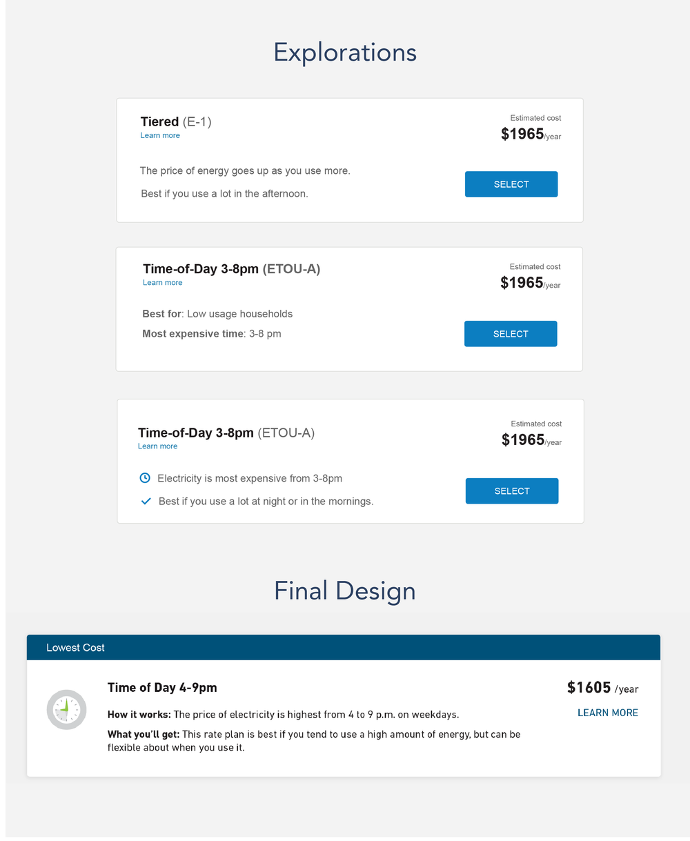
Design Refinement
Integrating research findings
- More intuitive grouping of rates.
- Prioritize learning and education.
- Honestly answer why utilities are offering cheaper rate plans.
- Treat add-ons as progressive filters.
- Made the survey questions as specific as possible.
- Pull out key points the user needs to know.
Ensuring systems consistency
- Aligned with Opattern design system and pulled out new patterns.
- Revise to meet accessibility and internationalization requirements.
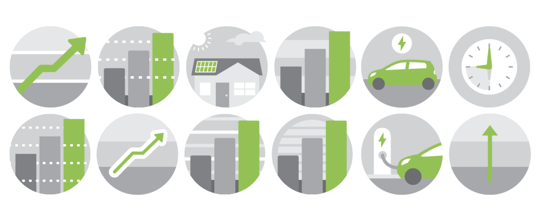
We generated a set of illustrations to represent the various rate plans
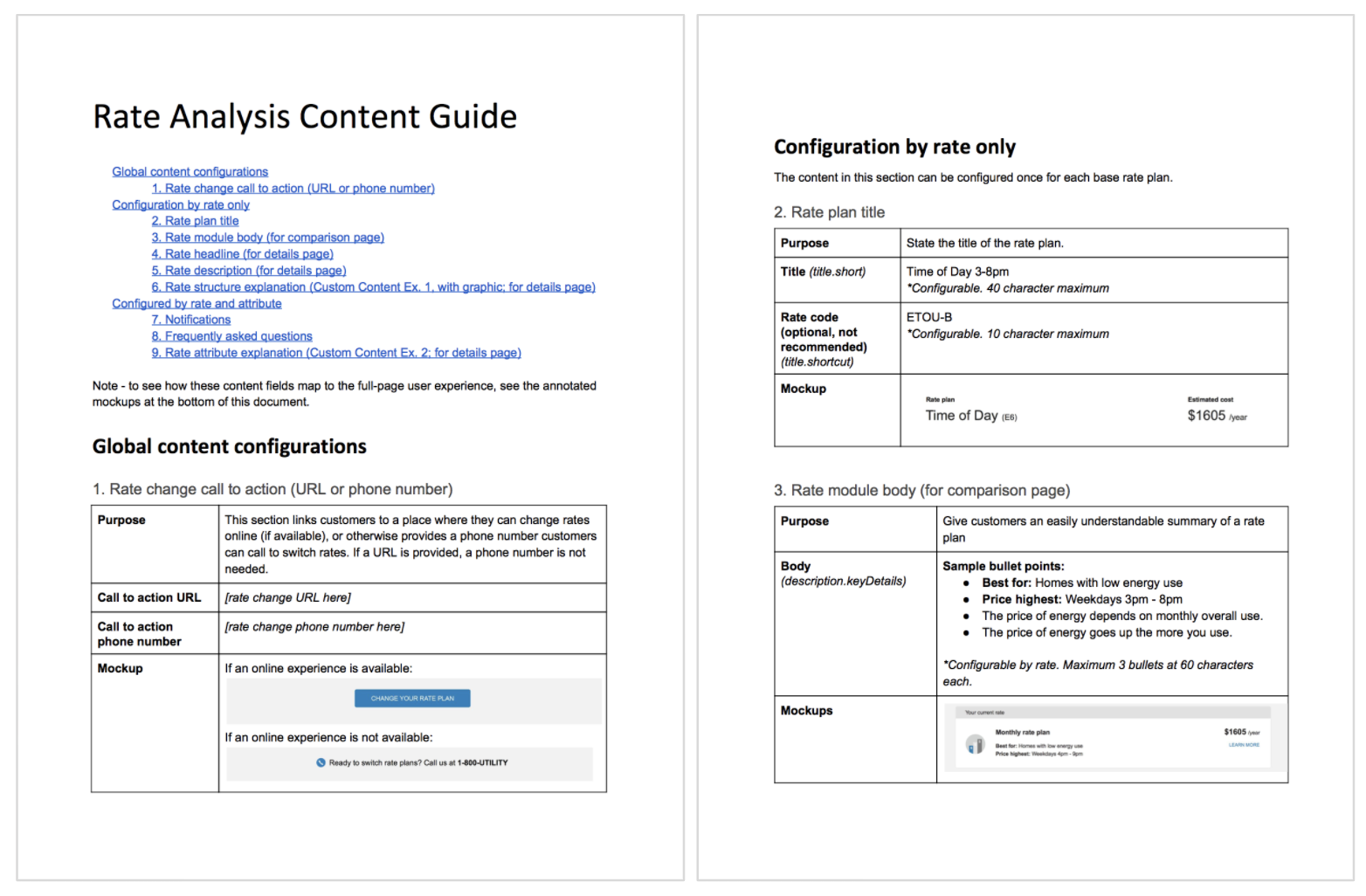
I worked with our delivery team and content strategist to develop a guide to help our clients clearly describe their rate plans
PG&E initially directed their internal marketing groups to use our model (although they couldn’t help making some adjustments).
We ran a final usability study
Study Details
- Eight remote sessions.
- All had high summer bills.
- 4 APS customers.
- 1 each from Con Edison, National Grid, Dominion, Commonwealth Edison.
Research goals
- Validate changes made after first round of testing.
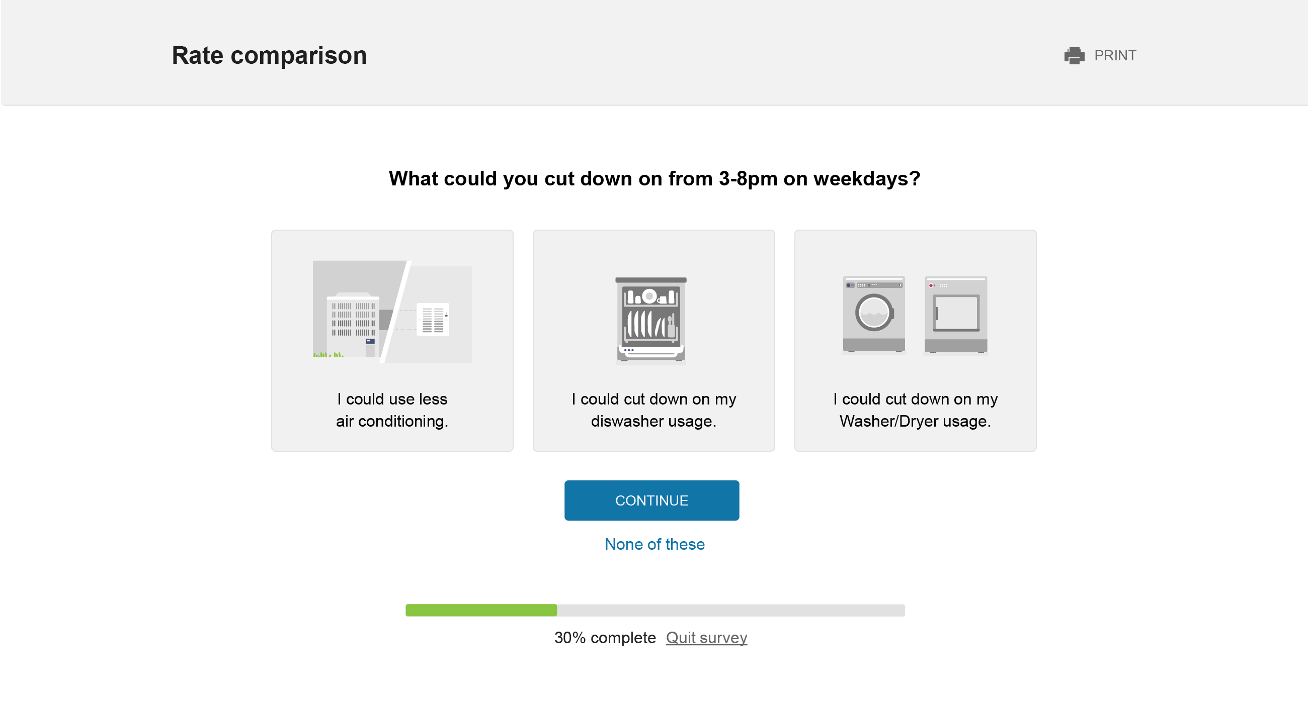
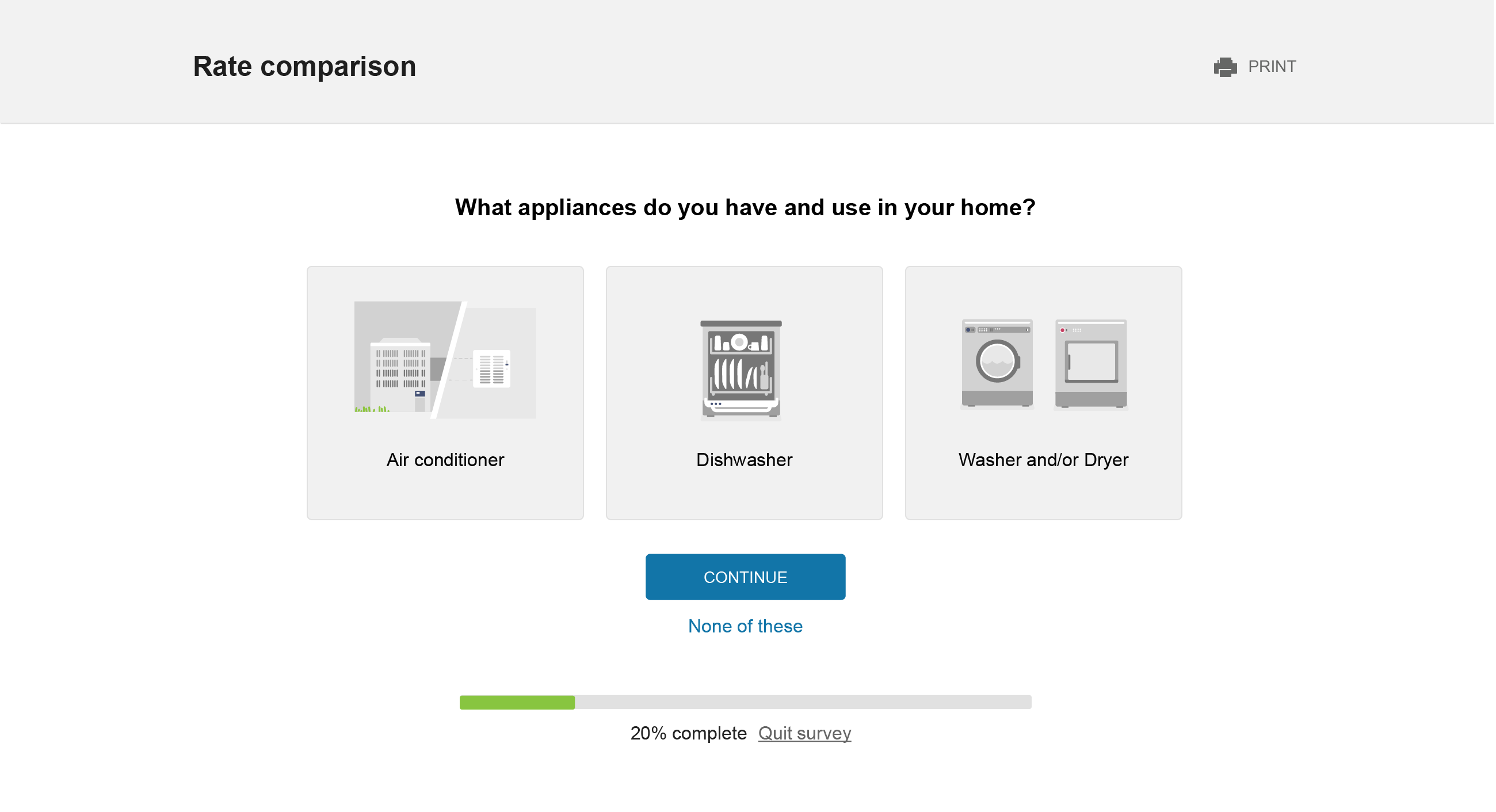
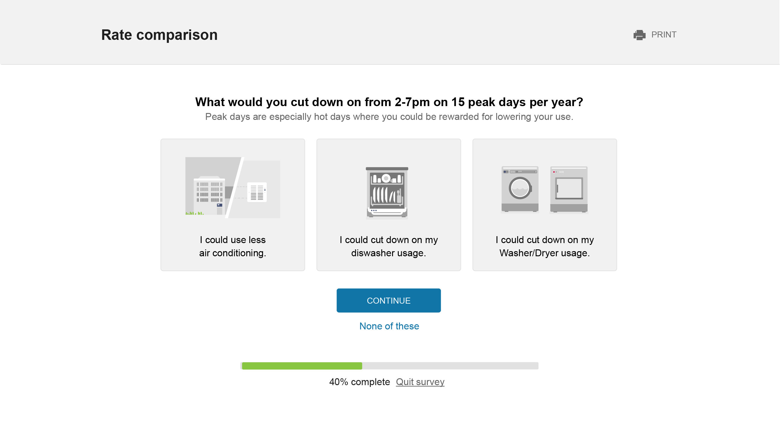
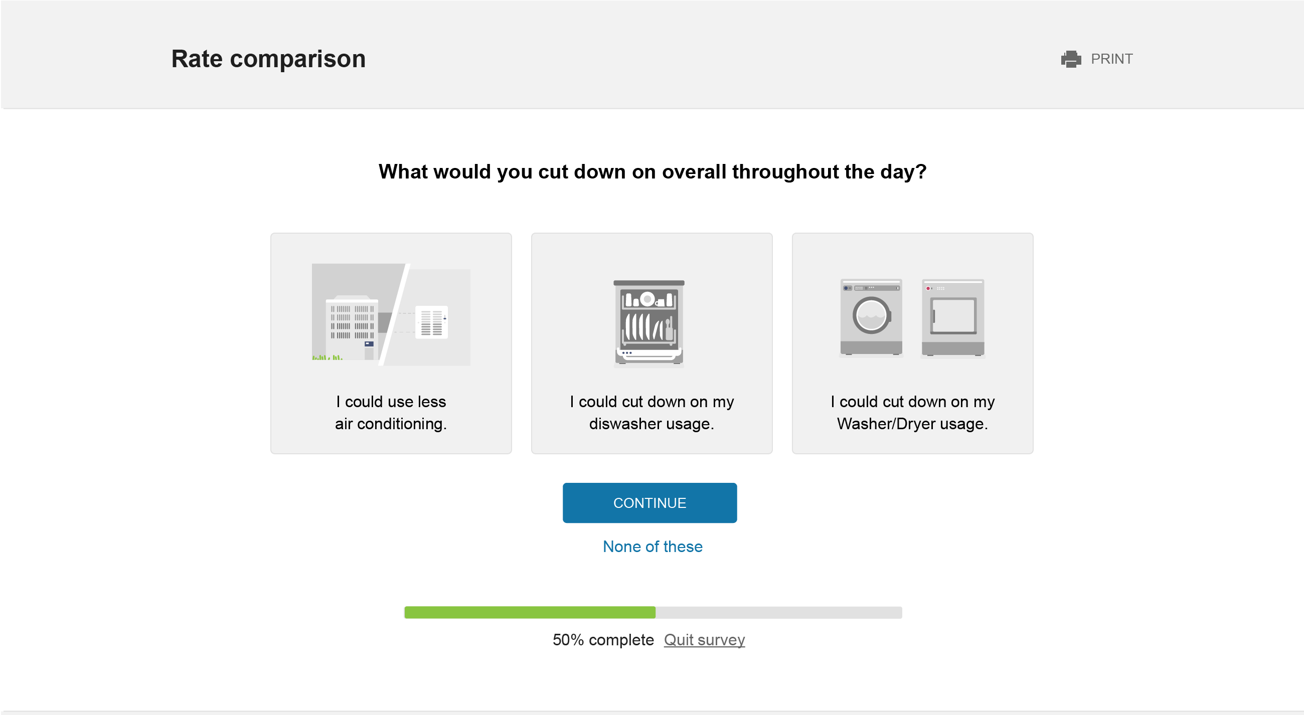
- Test a new, appliance-based concept for the ‘What if’ questions.
- Identify usability and comprehension issues.
High level usability results
- Much better comprehension than first round.
- Numerous copy/explanation problems that were confusing for the user.
- Users prefer in-depth rate simulator questions.
- Bulleted content model for rates helps users better compare.
- Still some confusion on whether calculations are based on past usage.
Final designs
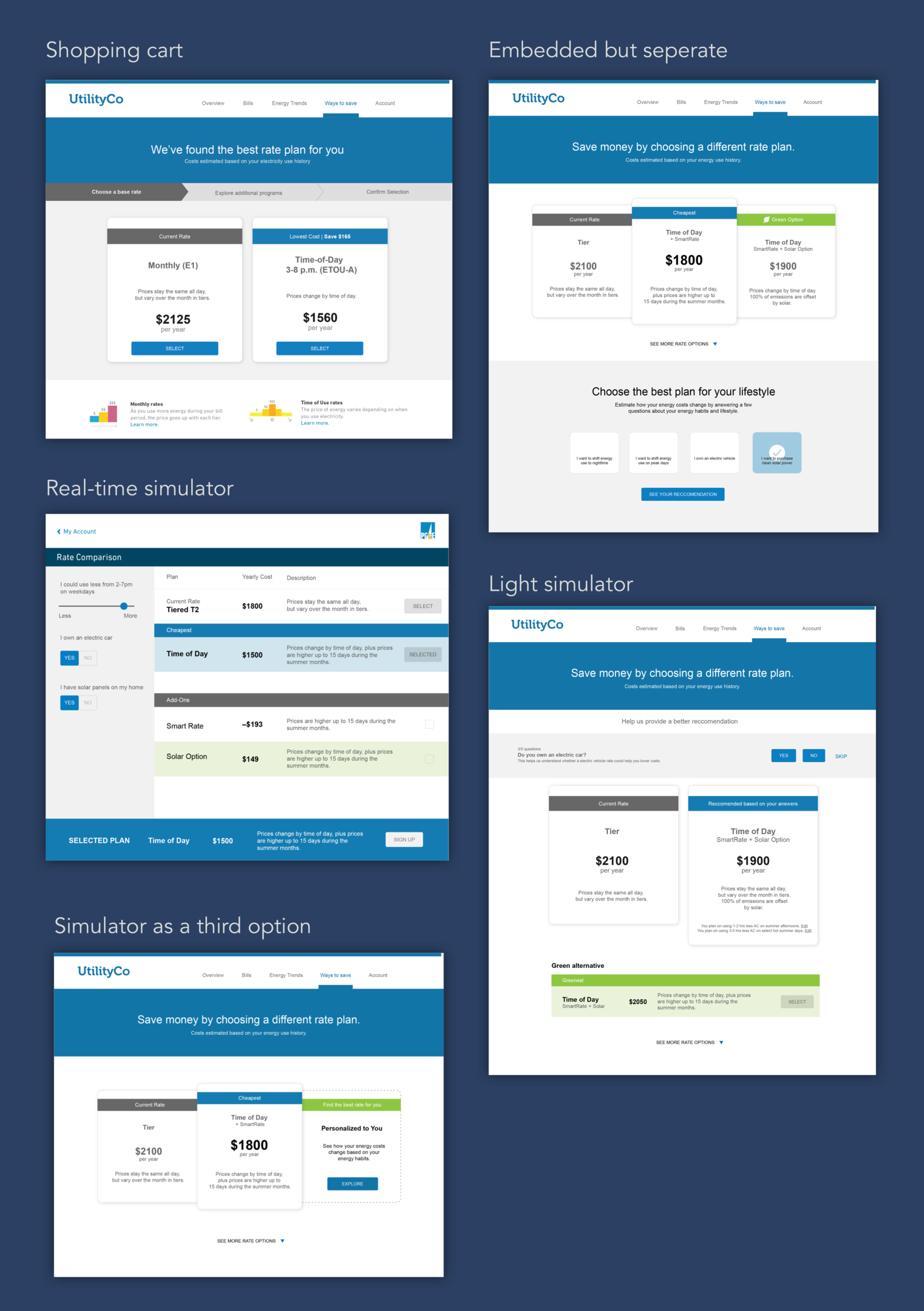
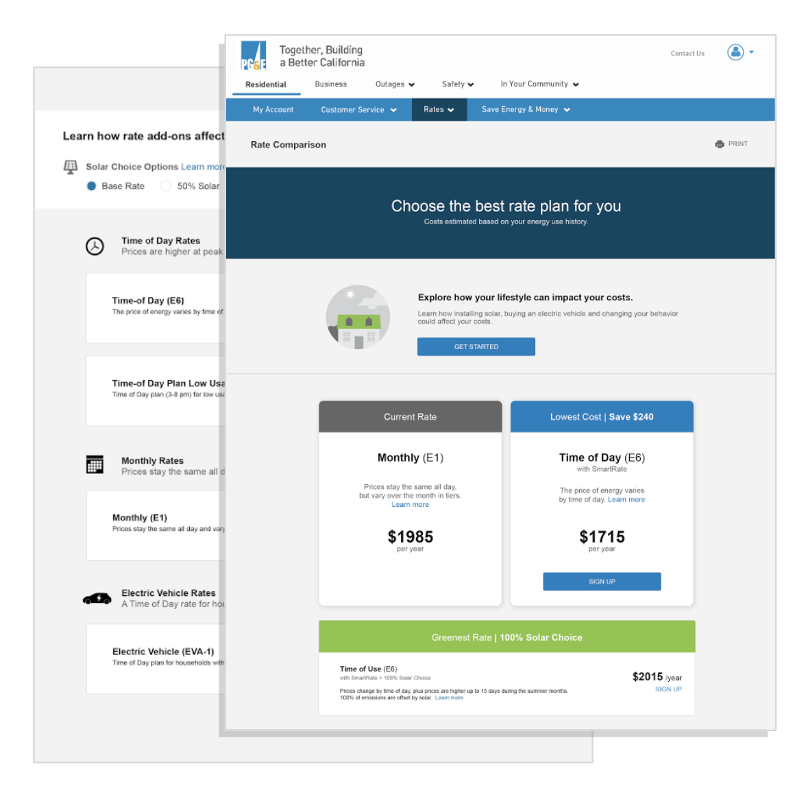
The following designs highlight the primary states of the product. Keep in mind this is a white label product so the color system is configurable per client.
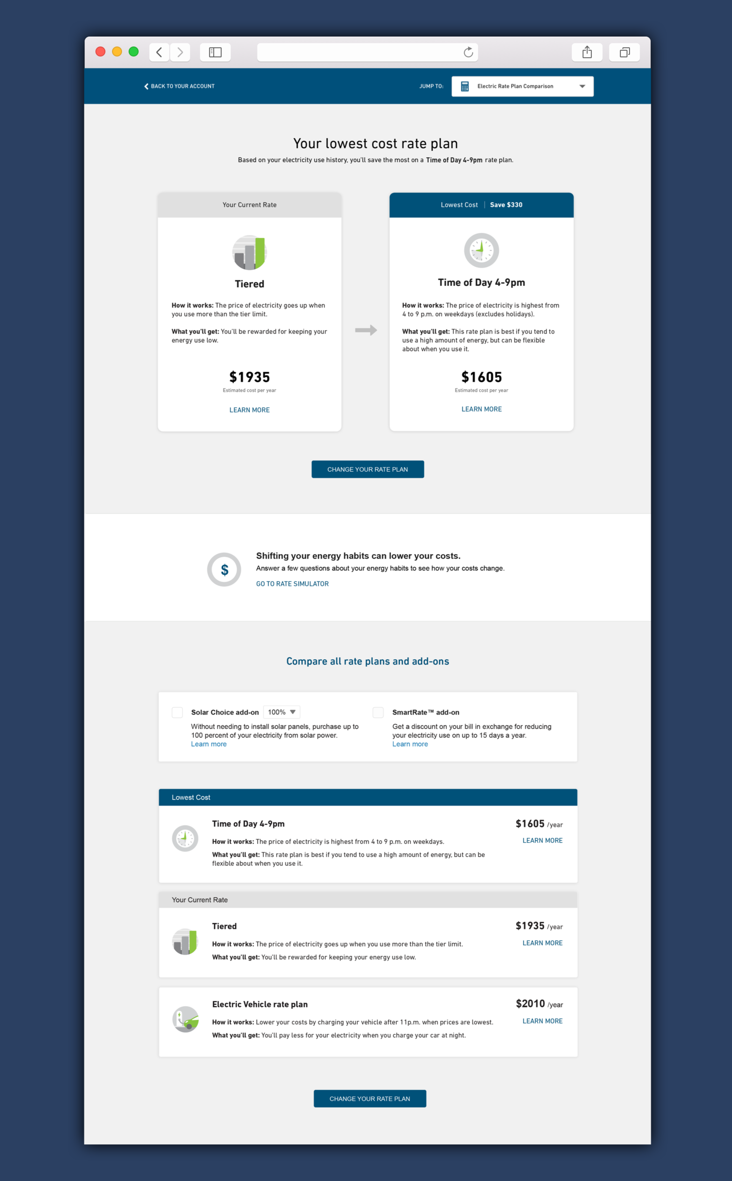
Rate comparison home
Use can navigate from the utility website and can quickly see the rate plan that will provide the most savings.
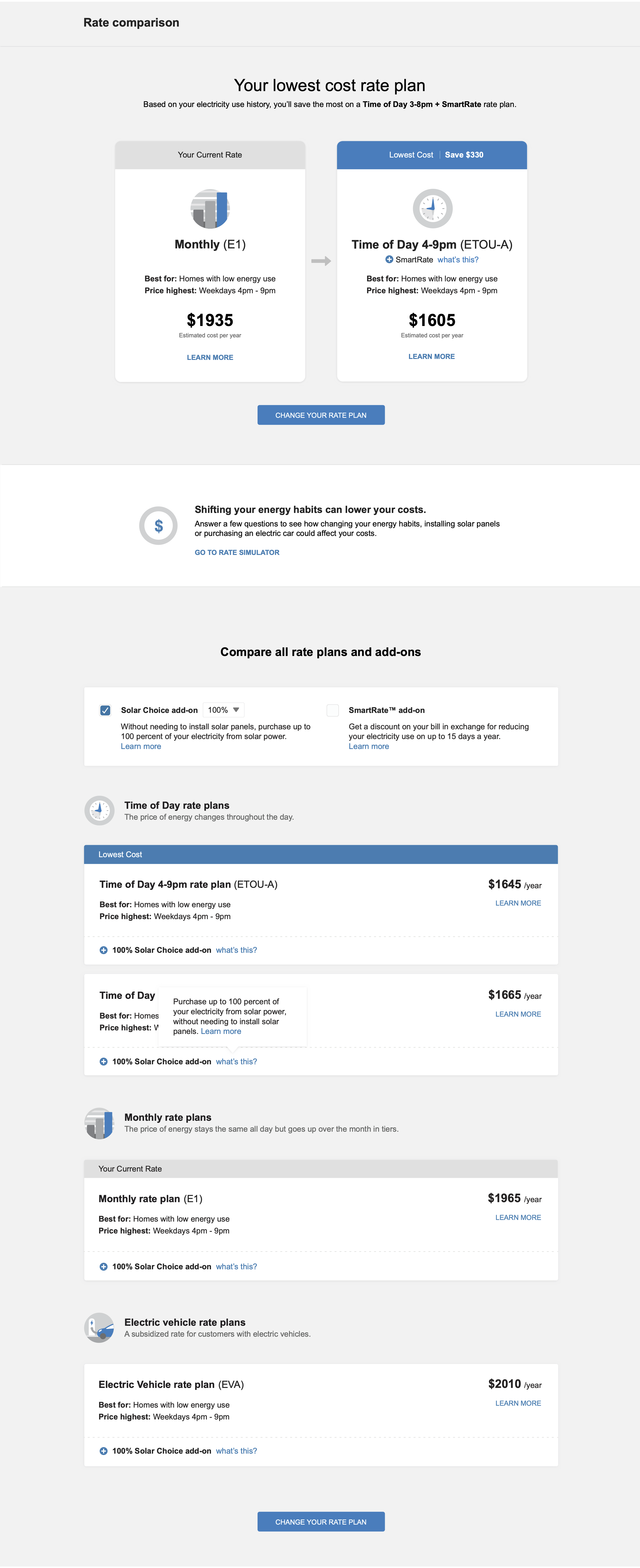
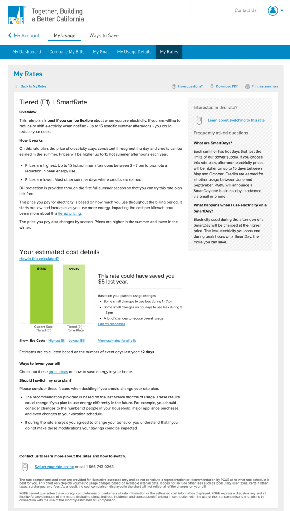
Rate plan details page
If a user wants to learn more about a rate plan, they can navigate to a details page.
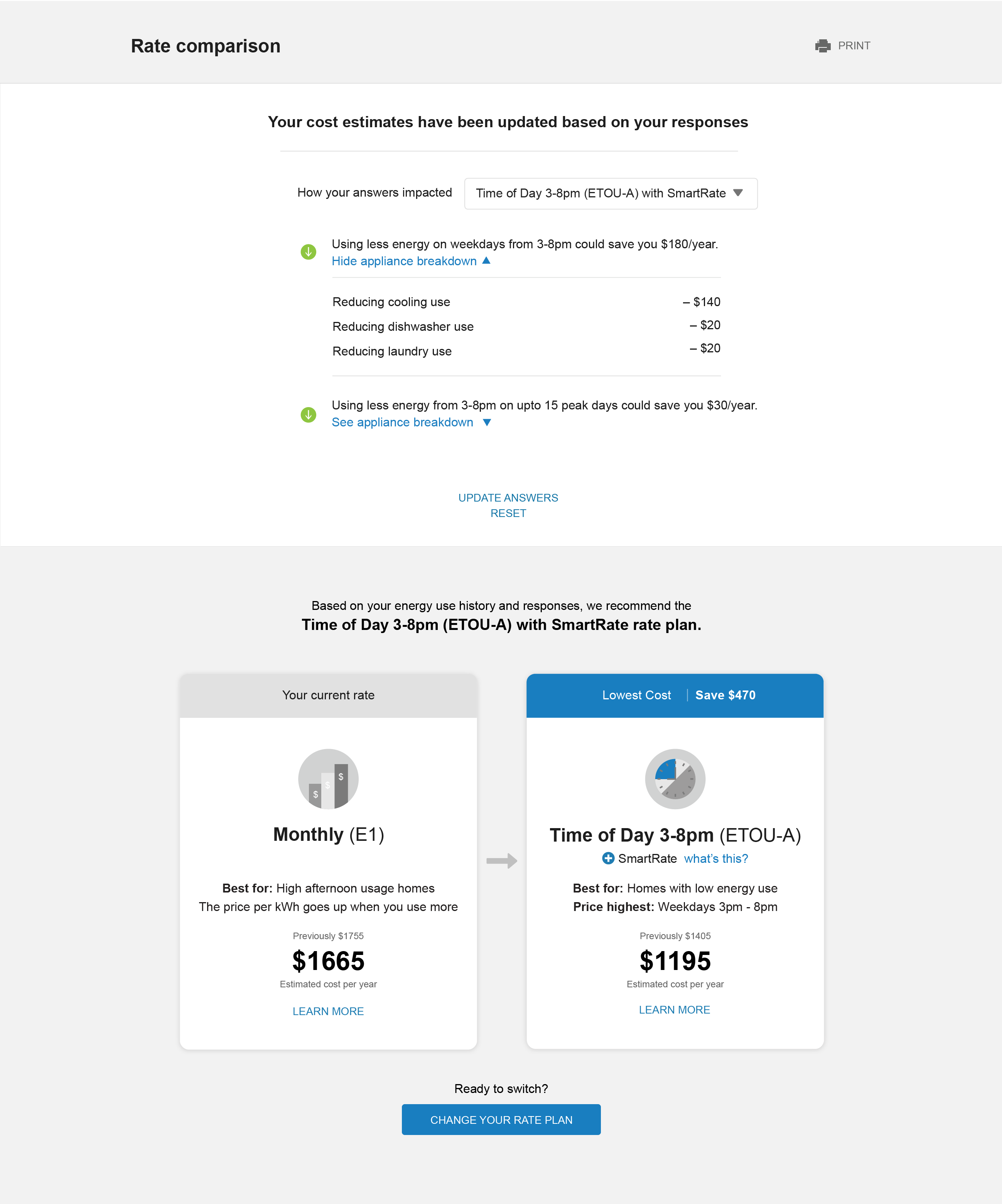
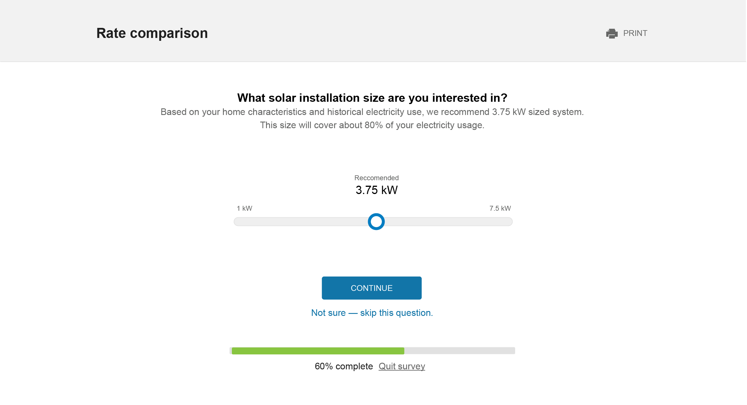
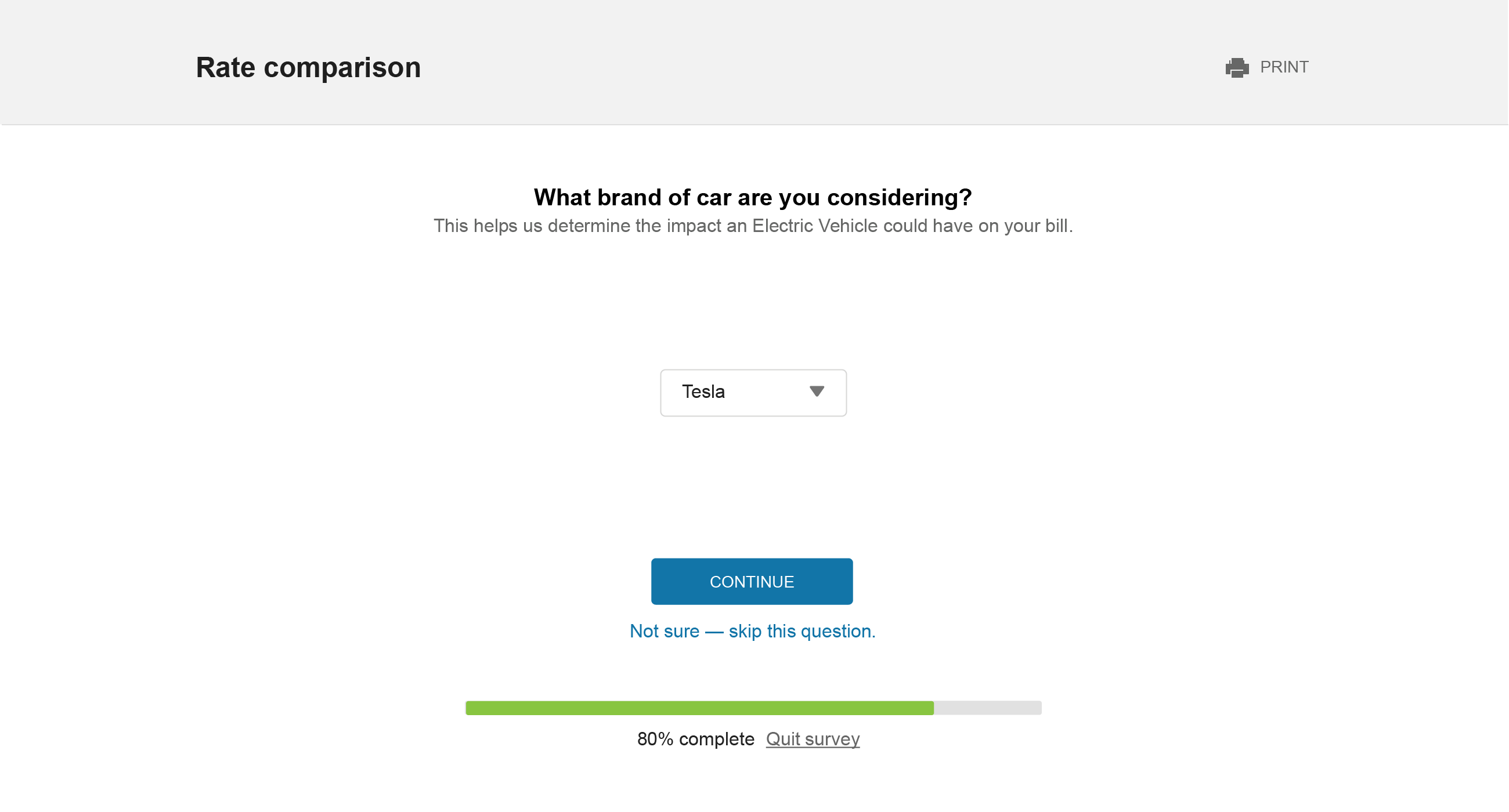
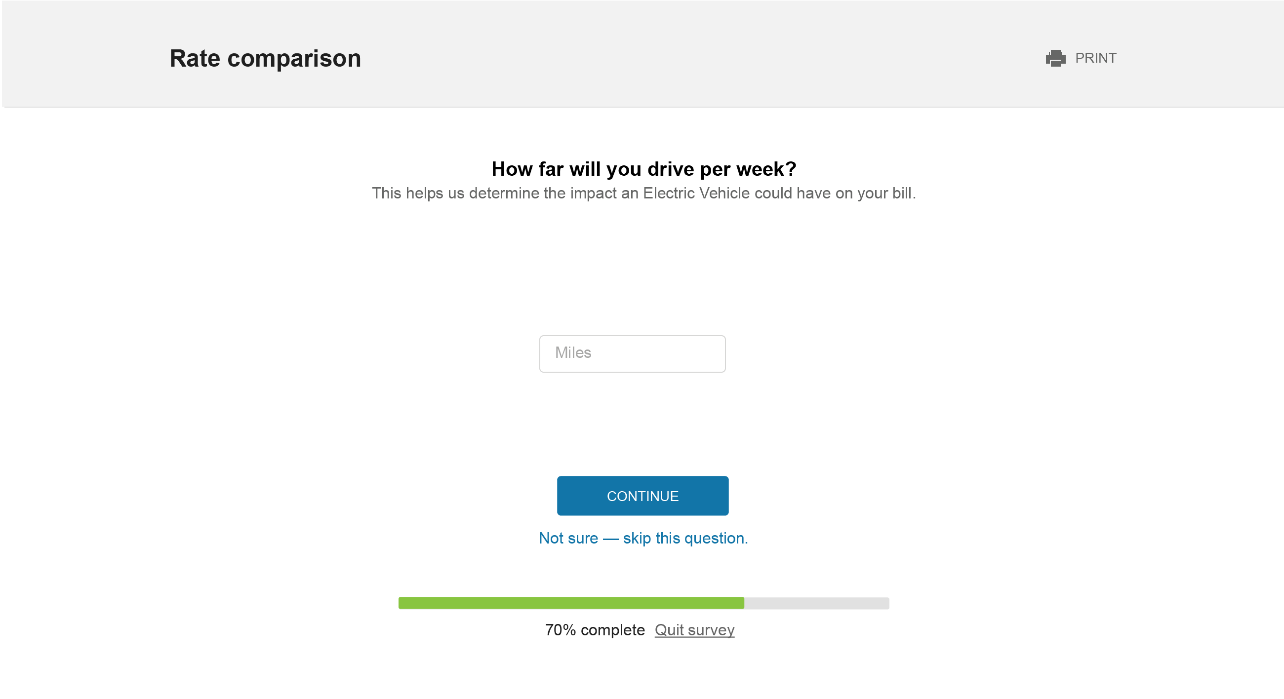
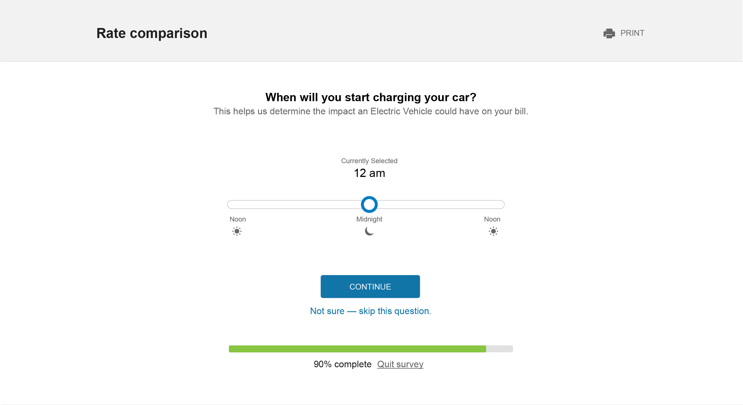
Rate simulator
The simulator asks questions that allows the user to see how behavioral changes would change which rate plan is best.
Show the result overlayed on the rate comparison page.